The Fascist Origins of the Iconic Star Wars Logo
All logos via Lucasfilm
Star Wars is one of the most recognizable brands in pop culture and it’s hard to imagine it without the famous logo STAR WARS, with its yellow-on-black, blocky letters and side tails filling the screen. But it didn’t start out that way, and has evolved over the decades.
One of the most surprising facts about the logo, however, is the inspiration it took from Nazi Germany.
A long time ago… A logo was needed
When George Lucas started work on his “space fantasy” movie, no-one really knew how to market it. Even the name of the movie changed a bit during production, and (surprise!) neither “Episode IV” nor “A New Hope” were part of it. The movie was originally titled The Star Wars, and eventually shortened to simply Star Wars.
Need Star Wars imagery? Just ask Ralph
Ralph McQuarrie, that brilliant concept artist responsible for so much of the imagery in the Star Wars universe, was tasked to come up with a movie logo. Working with his team they tried out a few possibilities, deciding on one developed by typographer Dan Perri.

This early logo was bold, eye-catching and evocative of the movie’s unique opening crawl. It didn’t look like what audiences expected in a science fiction movie, though, and for the 1977 movie posters a starry background was built into the original yellow, maintaining the arresting style but making it look more “spacey”.
More fascism, please
The first logo was good, but George Lucas wanted to develop it further: he wanted it to look “very fascist.” This had nothing to do with George’s political sensibilities, of course, but he had a vision for his movie and he wanted the logo to be intimidating. He wanted it to grab the viewer’s attention and not let go.
As luck would have it, designer Suzy Rice had been studying Nazi propaganda from the 1930’s and was perfect for the task. She knew that Nazi propaganda minister Joseph Goebbels had ordered all Nazi signage to use the same font, and while that exact font is unknown it’s believed to be the predecessor to Helvetica. Rice used the derivative Helvetica Black and came up with this concept:
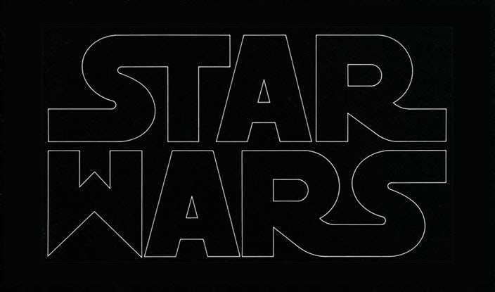
With a few tweaks by designer Joe Johnson, the iconic 1977 Star Wars logo was born.
![]()
Fascism was on-brand
It probably isn’t any surprise that Lucas took many design cues from fascist dictatorships to create his Imperial forces. The Empire is presented in no uncertain terms as an evil organization, an idea which hasn’t changed throughout the history of the franchise from a long-shot, wing-and-a-prayer summer film to a multi-billion dollar community.
Images for both the Empire and its successor the First Order never stray far from the basic symbols of fascism. One need only watch General Hux’s infamous speech at the firing of Starkiller Base’s weapon to see clearly how art meets history in these films.
The Star Wars logo over the years
Nobody expected Star Wars to be the runaway success it was, and its logo became a world-wide symbol for the growing franchise. But as work on the sequel started, there were complications over how to present the series as a whole.
The Empire Strikes Back logo
Everyone knew the name Star Wars, so excluding it from the title of the sequel was unthinkable. Originally the second movie was to be called Star Wars: Episode II – The Empire Strikes Back. This made sense from a branding point of view, but by then Lucas had already decided that some of his story took place before the original movie (still called Star Wars, at this point) so to name the next movie Episode II would eventually cause problems.
In perhaps the first instance of the long and glorious history of retcon in the Star Wars franchise, the name “Star Wars” was upgraded to the title of the entire series, the original movie was renamed A New Hope (and given the extra nomenclature Episode IV), and the new movie was declared Episode V and titled The Empire Strikes Back.
But nobody wanted to lose the Star Wars branding, so the logo designed for the new movie cleverly incorporated the striking “Star Wars” as a border around the new title. The word “Empire” is the most dominant feature, making it clear what the focus of the movie is. Interestingly, the angled style of the new movie’s title breaks away from heavy dominance of the fascist original logo and brings a more fantastic element into play.
Return of the Jedi logo
With the success of Empire, the third film in the series was highly anticipated. But the design of the Return of the Jedi logo seems somewhat flat compared to its predecessors. The iconic Star Wars symbol was maintained, but when presented as a top-runner over the main title it didn’t work quite as well as the perfect enclosure with Empire.

The style of font was also rather grim, and hardly indicative of the fun-filled, action-packed adventure which this film truly was. Design styles evolve and change over the years, but when comparing the logos of the Original Trilogy movies, Return of the Jedi is the least iconic.
The Prequel Trilogy logos
Phantom Menace certainly wasn’t the first prequel film ever made, but it was an unusual enough concept that George Lucas felt the need to make it clear to movie-goers that this film was based before the original 1977 classic.
The logo for Phantom Menace is unusual because the title of the movie is the least important visual element in the design. The iconic Star Wars logo is top left, giving it primacy for Western readers, but the main element in the logo is, surprisingly, the episode number. The title of the movie is almost an afterthought, and it’s no surprise that even today many people refer to this film as “Episode I” rather than “The Phantom Menace.”
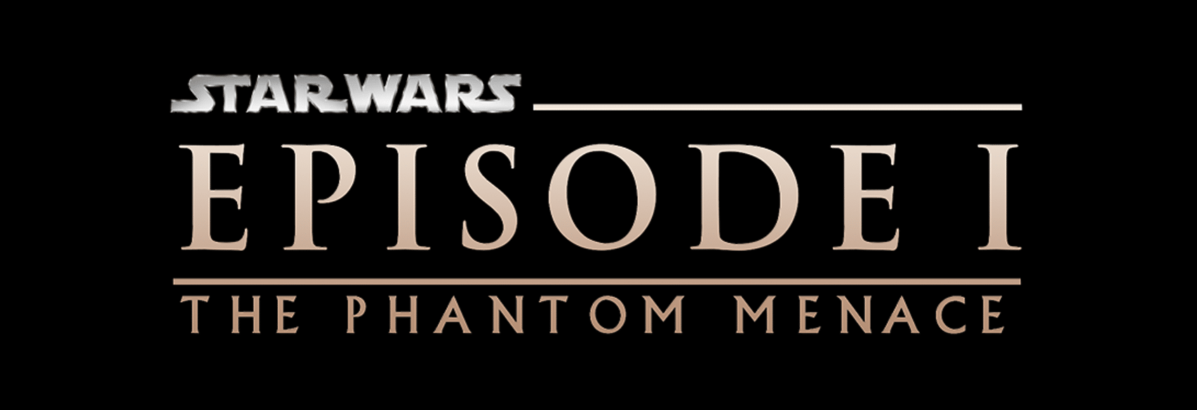
Unlike the original Star Wars movies and their eclectic features, the Prequel Trilogy logos are clearly related, with consistent design elements, color and art work. The episode number dominates in each case, and it’s clear that these three films are part of a united story.
![]()
![]()
Star Wars: The Clone Wars
Often overlooked by the casual Star Wars community, The Clone Wars began as a feature-length (and theater-released) animated film that spawned an epic, seven-season TV series. Some fans of that galaxy far, far away don’t always take The Clone Wars seriously, but this series is generally considered to be superior in story-telling and characterization than the Prequel Trilogy, giving a much better account of the galactic conflict only hinted at in Episodes II and III. It introduces Ahsoka Tano and features many previously underdeveloped characters like Mace Windu and Boba Fett. But most importantly, it provides the necessary character development of Anakin Skywalker to explain why he fell from the Light Side of the Force and became Darth Vader.
The logo for Clone Wars is clearly part of the same family as the original Star Wars, using the font and color of the 1977 logo and wrapping the main title in “Star Wars” just like the Empire logo. Creating a feature-length animated movie was certainly a risk for Lucasfilm, and the logo was designed to offer familiarity for fans.

The Sequel Trilogy logos
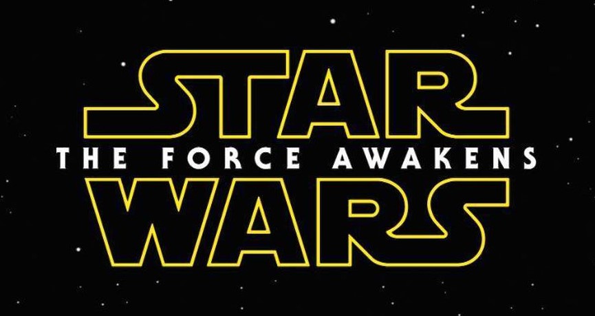
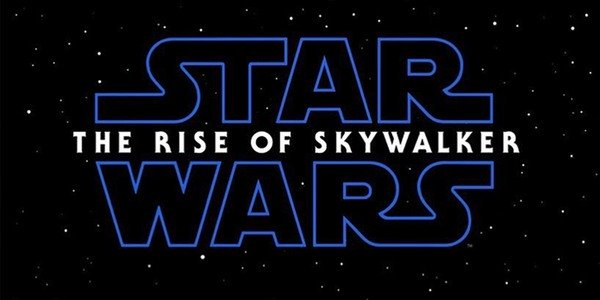
When Lucasfilm was bought by Disney there was much hand-wringing in the fan community about whether the franchise would survive intact. Disney was conscious of this and reached back to familiar symbols when the new movie logos were created.
All three movies were presented with the original, bold Star Wars symbol as the most prominent design feature, with the title of the movie slipped in the middle. It’s almost like Disney wanted to say, “Yes, this is still the Star Wars you grew up with,” and the basic message of the logos seems to be reassurance. By looking back to the classic images of the 1977 movie, Disney wanted to tell fans that the purchase of the franchise was more than just a business deal.
One interesting aspect, though, is the color used for each movie. The Force Awakens presents the Star Wars symbol in classic yellow. The Last Jedi, however, gives us the same symbol in red, as a sign of the looming threat. The Rise of Skywalker, in turn, displays the symbol in blue, which might evoke the blue of Jedi lightsabers and therefore of hope.

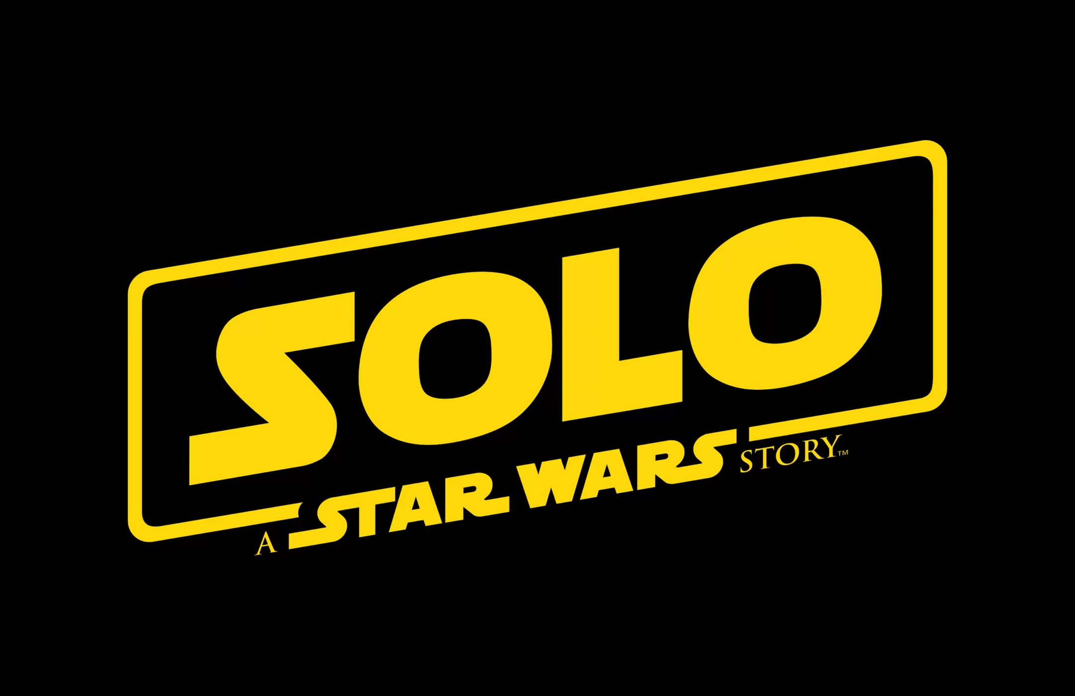
The Star Wars Stories logos
The idea of Star Wars spin-offs began with great excitement, giving fans the chance to explore stories away from the main saga and perhaps address age-old questions about the galactic conflict. Rogue One was very well-received, but its logo bears resemblance to Return of the Jedi and does little to capture its dark grittiness. Solo, however, reaches farther back for inspiration, with the color of the 1977 Star Wars and the upswept font and wraparound border of Empire.

Fascist imagery in Star Wars
The decision by George Lucas to create a “very fascist” logo for his 1977 movie was inspired. The stark power of the symbol has carried through every Star Wars movie logo since, and while these design features can’t by themselves account for the visual draw of the franchise, they’re certainly relevant.
From the Imperial clothing in A New Hope to the First Order victory speech in Force Awakens to the raw lust for power in Rogue One, Star Wars set out to explore the evil of fascism. We watch the Rebel Alliance fight to save the galaxy, secure that we’re cheering for the good guys in large part because the subtle use of fascist symbols, from the initial logo onward, has prepared us for a titanic battle where good will triumph over evil.
Bennett R. Coles is an award-winning, best-selling author and ghostwriter of science fiction and space fantasy series. His newest novel, Light in the Abyss, is now available here.